Telemetry Dashboards
The telemetry dashboards help you understand how your Keboola projects and organization consume resources. To access them, click your profile picture in the top right corner.
Key Terms
Section titled “Key Terms”- Credits (PPU) — Platform Processing Units, the standard unit of resource consumption in Keboola. Pay-As-You-Go projects use minutes instead.
- Component — a tool type in Keboola (e.g., Snowflake SQL Extractor, Python Transformation). A configuration is a specific saved instance of a component with its settings.
- Flow — an automated sequence of tasks (previously known as orchestration). Flows can be scheduled or triggered manually.
Three dashboard types are available:
- Project Consumption — always available for every project
- Organization Usage — available for organizations with a contract
- Activity Center — the most detailed view; must be enabled by your account manager
All dashboards include a date range filter at the top (default: last 6 months) and a data freshness indicator showing when the data was last updated. You can click Refresh to trigger a background data update when newer source data is available.
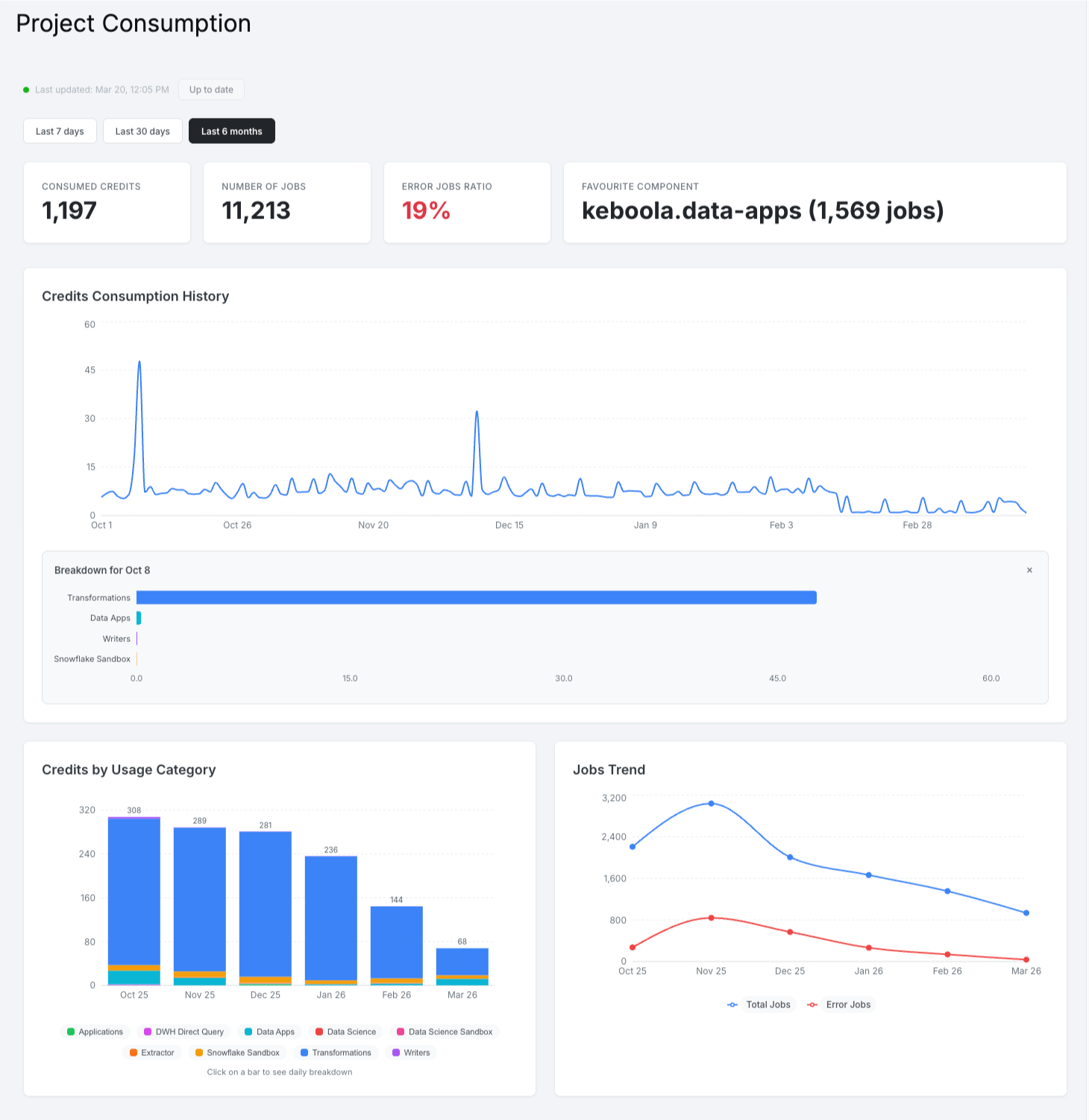
Project Consumption
Section titled “Project Consumption”The Project Consumption dashboard shows usage metrics for a single Keboola project. It is available to everyone with access to the project.
The dashboard automatically detects whether the project uses a credit-based (standard) or minute-based (Pay-As-You-Go) billing model and displays the appropriate metrics.
Four summary cards are displayed at the top:
| KPI | Description |
|---|---|
| Consumed Credits (or Minutes Consumed for PAYG) | Total credits or minutes used in the selected period |
| Number of Jobs | Total jobs executed |
| Error Jobs Ratio | Percentage of jobs that ended in error (highlighted in red if above 5%) |
| Favourite Component | The component with the most jobs, along with its job count |
Charts
Section titled “Charts”- Credits Consumption History (or Minutes History for PAYG) — line chart showing consumed credits over time. For PAYG projects, a second line shows available minutes on the right Y-axis.
- Credits by Usage Category (or Minutes by Usage Category for PAYG) — stacked bar chart (monthly view) or line chart (daily view) breaking down consumption by category. Click on a bar to drill down to daily detail. Click on legend items to show or hide categories.
- Jobs Trend — line chart showing total jobs and error jobs per month.
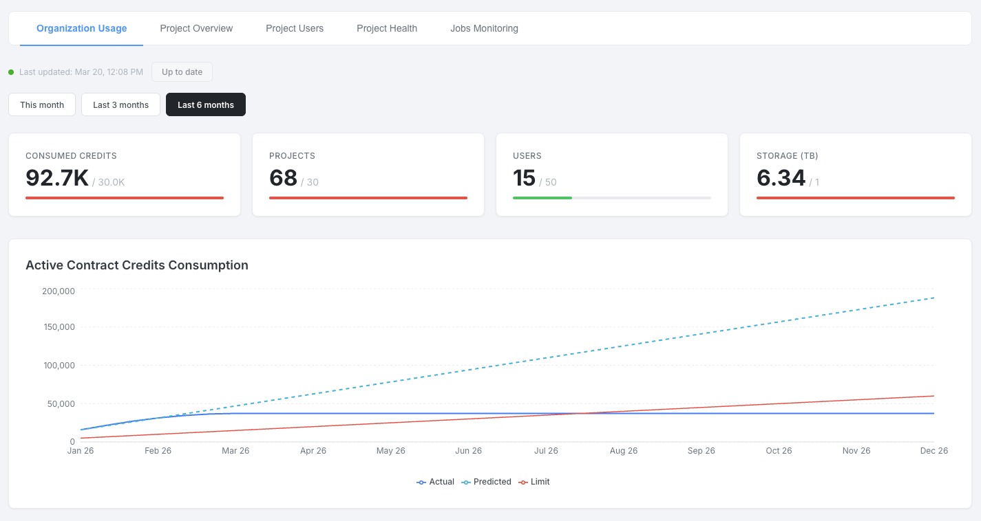
Organization Usage
Section titled “Organization Usage”The Organization Usage dashboard shows consumption across all projects in your organization. It is available to organizations with an active contract. This content is also available as the Organization Usage tab within the Activity Center.
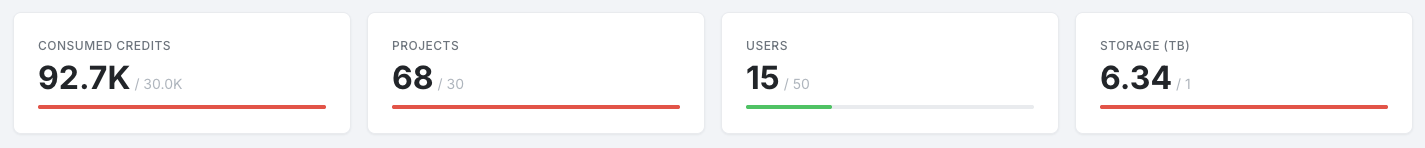
Four KPI cards compare current usage against contract limits:
| KPI | Description |
|---|---|
| PPU (Credits) | Credits consumed vs. contract limit for the selected period |
| Projects | Number of active projects vs. contract limit (current month) |
| Users | Number of users vs. contract limit (current month) |
| Storage TB | Storage used vs. contract limit (current month) |
Each KPI includes a progress bar: green below 80%, orange at 80–99%, and red at 100% or above.
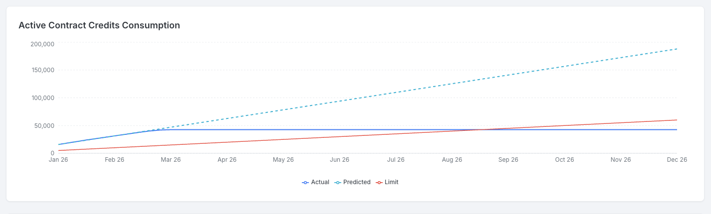
Active Contract Consumption
Section titled “Active Contract Consumption”A line chart with three lines showing PPU consumption relative to the contract:
- PPU (solid) — actual monthly consumption
- Predicted PPU (dashed) — prediction based on the average of the last three months
- PPU Limit (red) — monthly credit allocation from the contract
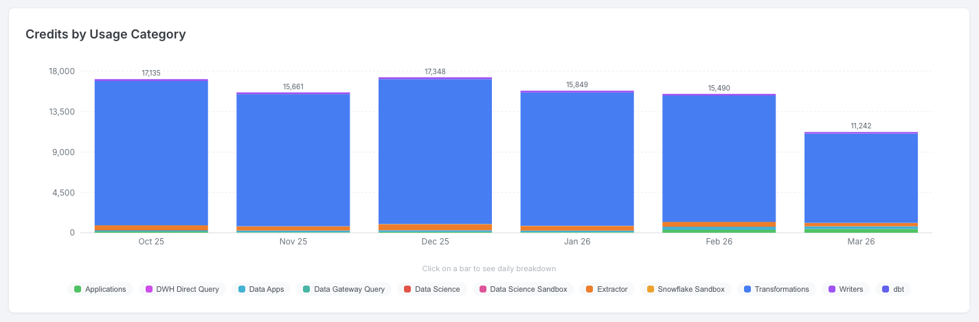
Consumption
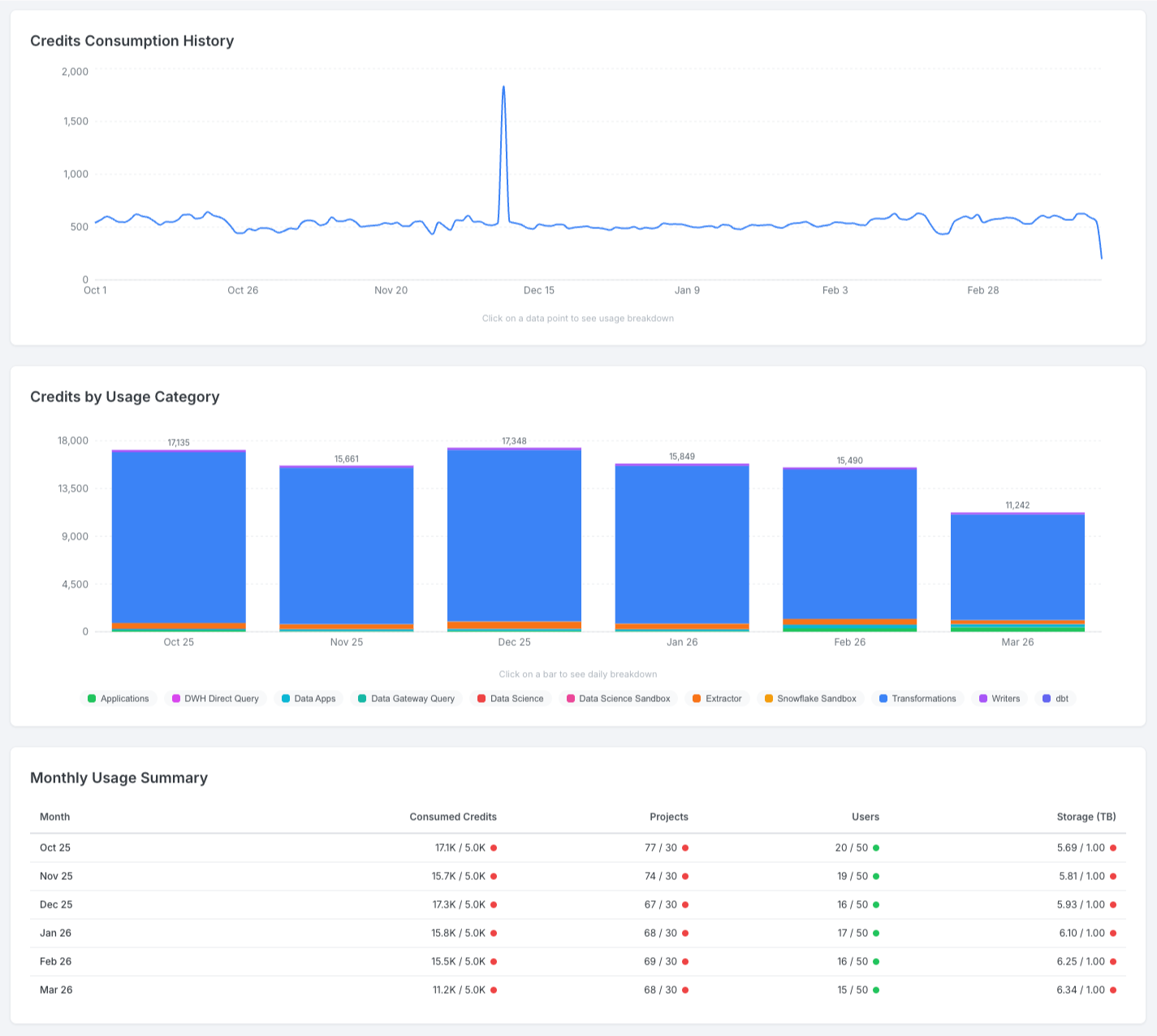
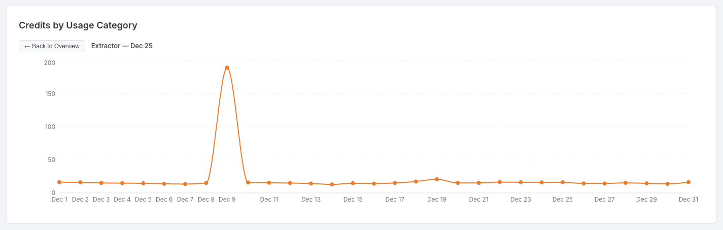
Section titled “Consumption”- Credits Consumption History — daily credits as a line chart. Click on a data point to see a breakdown by usage category.
- Credits by Usage Category — stacked bar chart (monthly) or line chart (daily) showing consumption by category. Toggleable legend; click a bar to drill down.
- Monthly Usage Summary — table listing each month with PPU used vs. limit, projects, users, and storage. Color indicators (green/orange/red) use the same thresholds as the KPI cards.
Top Projects and Components
Section titled “Top Projects and Components”Four horizontal bar charts showing the most demanding areas of your organization:
- Top Projects by Consumed Credits — top 10 projects ranked by credit consumption
- Most Demanding SQL Transformations — top 10 SQL transformation configurations by credits
- Most Demanding non-SQL Transformations — top 10 non-SQL transformation configurations by credits
- Most Demanding Component Configurations — top 10 non-transformation component configurations by credits
All four charts support Load more and Show less to expand beyond the top 10. Project names link directly to Keboola.
Configuration Health
Section titled “Configuration Health”Two side-by-side trend charts:
- Flows Health — total and error flow runs over time
- Jobs Health — total and error job runs over time
Each chart includes a Show by Project toggle that switches to a sortable per-project breakdown table.
Activity Center
Section titled “Activity Center”The Activity Center provides the most detailed insight into your telemetry data across all projects in your organization. It is not available by default — contact your account manager to enable it. You will need to designate a target project where the Activity Center will be accessible.
Once enabled, the Activity Center is visible to everyone with access to the target project. Although it lives in one project, it shows data for all projects associated with your organization.
Shared Controls
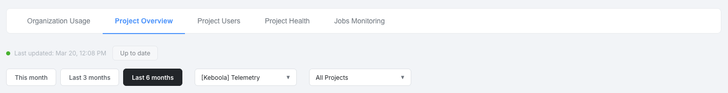
Section titled “Shared Controls”All five tabs share the following controls:
- Date range filter — preset options (This month, Last 3 months, Last 6 months). Jobs Monitoring uses a custom date picker defaulting to yesterday–today.
- Organization filter — multi-select dropdown with fuzzy search. Selecting an organization filters the project dropdown and all tab data to that organization’s projects. Visible on all tabs except Organization Usage.
- Project filter — multi-select dropdown with fuzzy search. Constrained by the selected organization. Available on project-specific tabs.
- Data freshness indicator — shows when data was last updated, with a Refresh button to trigger background regeneration.
Organization Usage {#ac-organization-usage}
Section titled “Organization Usage {#ac-organization-usage}”This tab is identical in content and functionality to the standalone Organization Usage dashboard described above — KPIs with contract limits, Active Contract Consumption, Consumption charts, Top Projects and Components, and Configuration Health. Please refer to that section for a detailed description of each visual.
Project Overview
Section titled “Project Overview”This tab focuses on credit consumption patterns and highlights the most expensive projects, transformations, and components.
Credits by Usage Category
Section titled “Credits by Usage Category”Stacked bar chart (monthly) or line chart (daily) showing PPU consumption broken down by category. Click on legend items to toggle categories; click on a bar to drill down to daily detail.
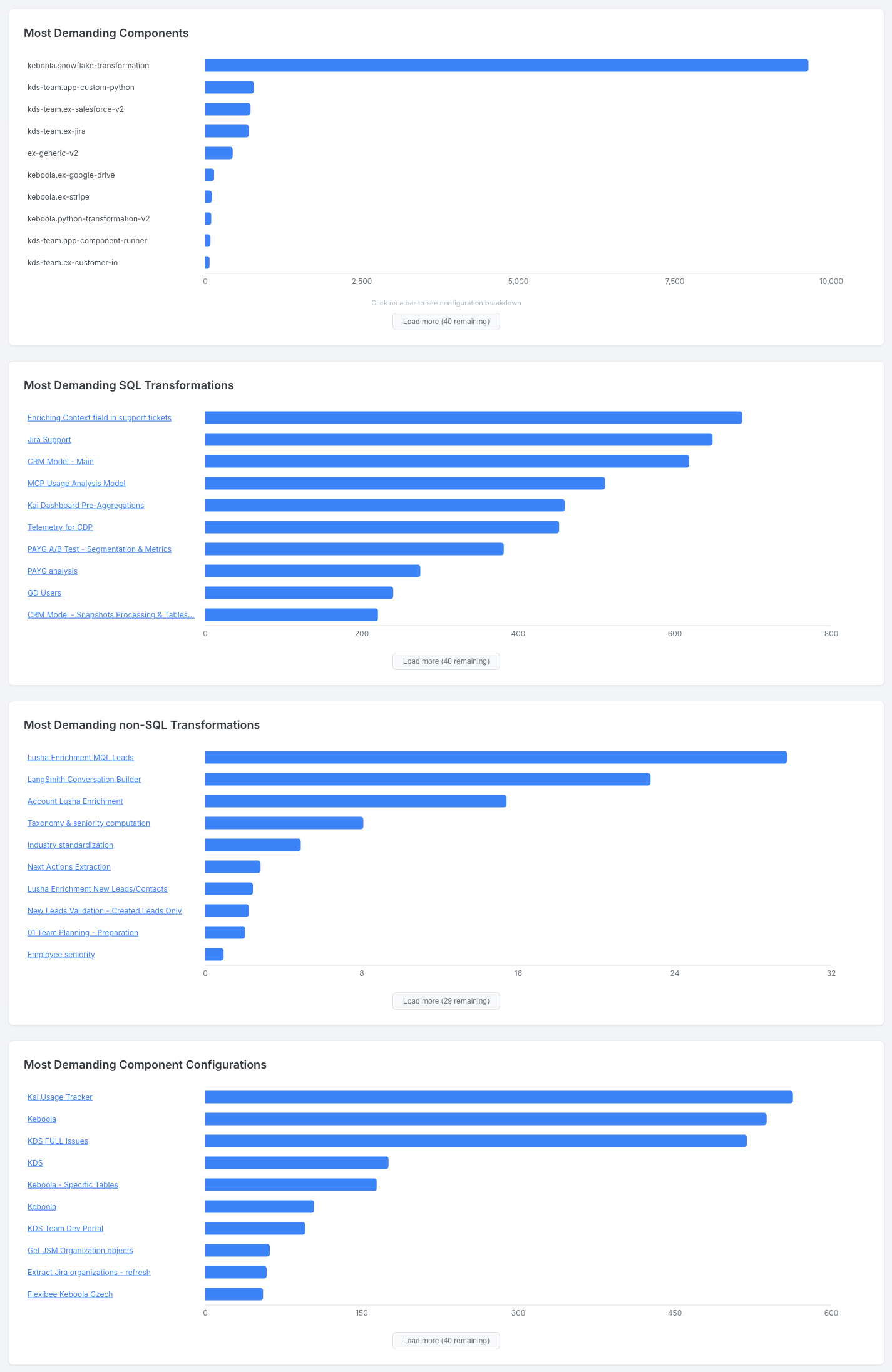
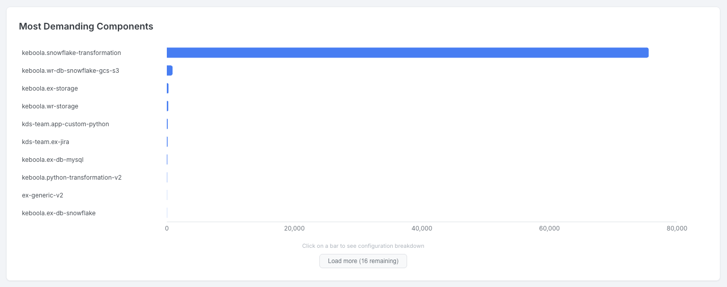
Most Demanding Components, Transformations, and Configurations
Section titled “Most Demanding Components, Transformations, and Configurations”Four horizontal bar charts ranking the top consumers:
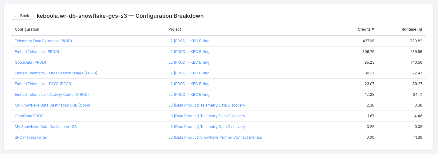
- Most Demanding Components — top 10 components by credits. Click on a bar to see a Configuration Breakdown table with configuration name, project, credits, and runtime hours.
- Most Demanding SQL Transformations — top 10 SQL transformation configurations by credits
- Most Demanding non-SQL Transformations — top 10 non-SQL transformation configurations by credits
- Most Demanding Component Configurations — top 10 non-transformation configurations by credits
All charts support Load more / Show less.
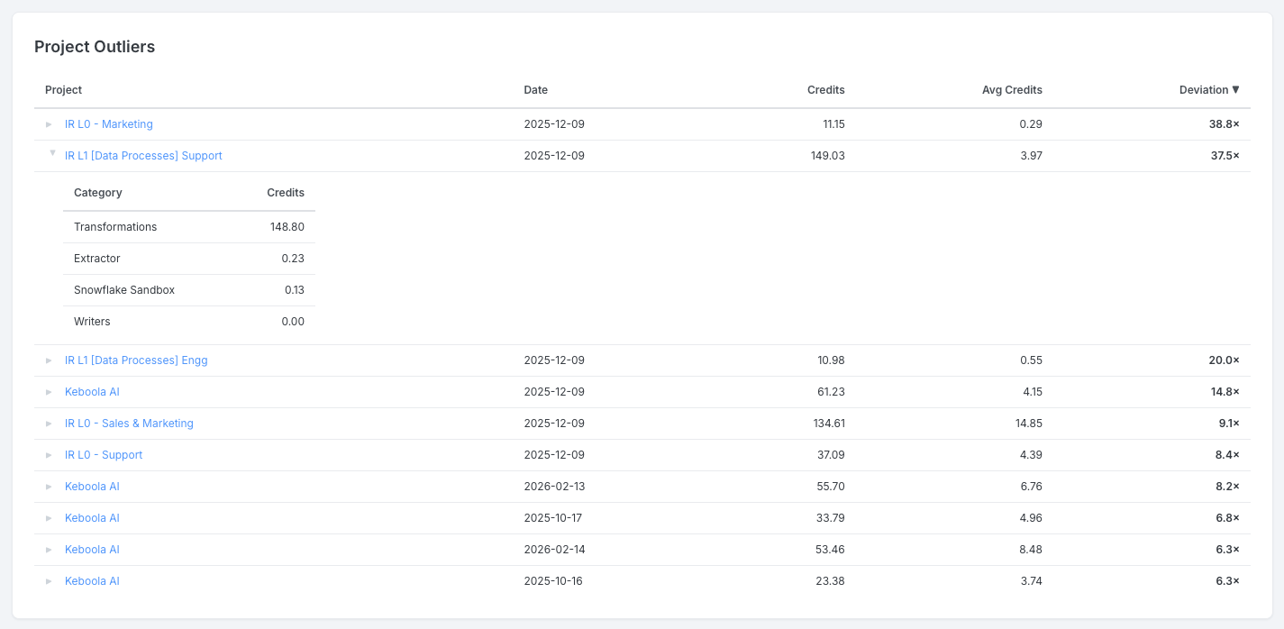
Significant Changes (Outliers)
Section titled “Significant Changes (Outliers)”This section helps you spot sudden, unexpected changes in credit consumption. It highlights cases where daily spending significantly exceeded its recent average — which could indicate an inefficient query, a change in data volume, or a misconfigured schedule.
Three tables are available:
- Project Outliers — projects whose daily spend exceeded 2× their 30-day average (minimum 10 credits). Expand a row to see a per-category credit breakdown.
- Configuration Outliers — individual configurations with the same deviation pattern. Deviations above 3× are highlighted in red. Configuration names link to Keboola.
- User Outliers — user tokens with above-average consumption. Expand a row to see top configurations and components.
All tables are sortable by any column.
Project Users
Section titled “Project Users”This tab provides visibility into user activity, roles, and consumption within your projects.
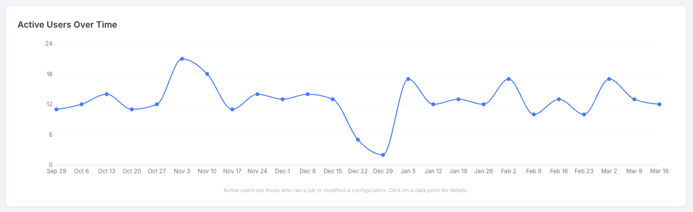
Active Users Over Time
Section titled “Active Users Over Time”Line chart showing the count of active users per day (or per week for ranges longer than 31 days). Click on a data point to see a sortable table of individual users with their activity counts by type (Configuration Update, Job Run, Job Error).
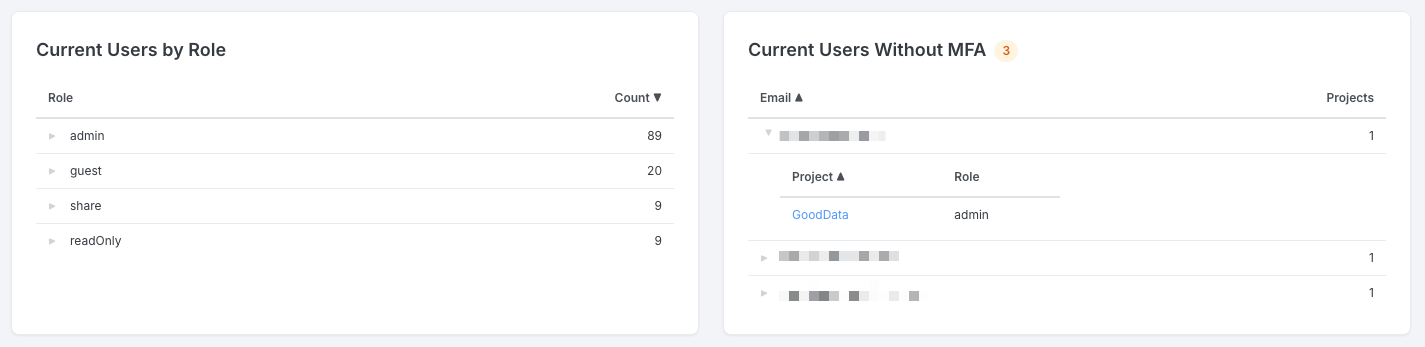
Current Users by Role
Section titled “Current Users by Role”A table showing users grouped by role with a count per role. Expand a role to see individual users with their email and project.
Current Users Without MFA
Section titled “Current Users Without MFA”A table listing users who have not enabled multi-factor authentication. Expand a user to see their projects and roles.
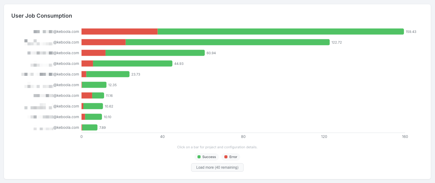
User Job Consumption
Section titled “User Job Consumption”Horizontal stacked bar chart showing the top 10 users by credit consumption, split into success and error credits. Click on a bar to see a detail table with project, component, configuration, credits, jobs, and errors. Supports Load more / Show less.
Newly Added Users
Section titled “Newly Added Users”A sortable table showing users added in the last 7 days, with email, project, role, invited by, and date.
Project Health
Section titled “Project Health”This tab helps you monitor the health of jobs, flows, and configurations across your projects.
Overview KPIs
Section titled “Overview KPIs”Six KPI cards summarizing job and flow health:
| KPI | Description |
|---|---|
| Jobs Error Ratio | Percentage of non-flow jobs ending in error |
| Error Jobs | Total count of error jobs |
| Flows Error Ratio | Percentage of flow jobs ending in error |
| Error Flows | Total count of error flows |
| Flows Warning Ratio | Percentage of flows ending with a warning |
| Warning Flows | Total count of warning flows |
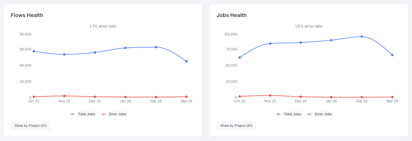
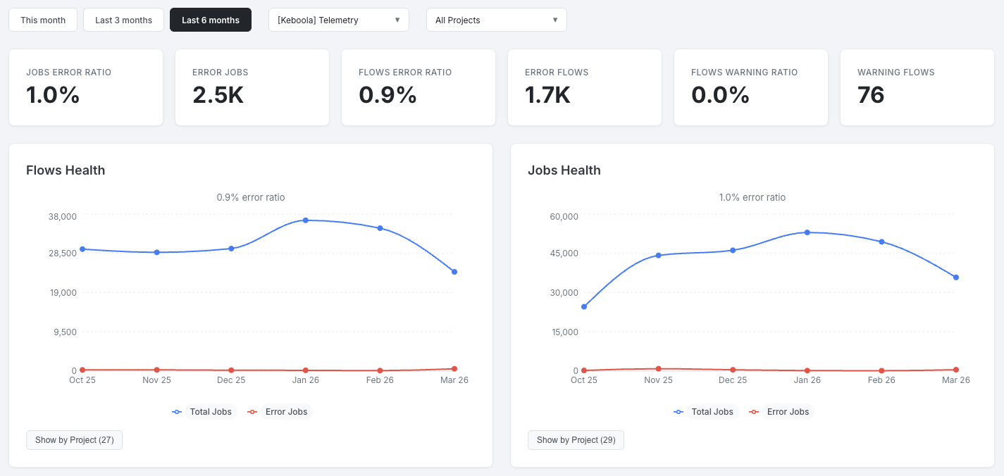
Flows Health and Jobs Health
Section titled “Flows Health and Jobs Health”Two side-by-side trend charts showing total and error runs over time. Each includes a Show by Project toggle that switches to a sortable per-project breakdown table.
Consumed Credits by Error Jobs
Section titled “Consumed Credits by Error Jobs”Line chart showing the trend of credits consumed by jobs that ended in error. Click on a data point to see a sortable detail table with project, component, configuration, token, and credits.
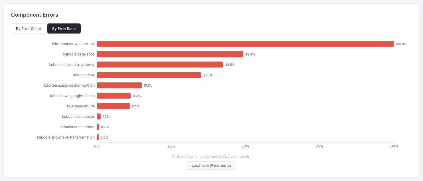
Component Errors
Section titled “Component Errors”Horizontal bar chart showing the top 10 components by error count. Toggle between By Error Count and By Error Ratio. Click on a bar to see a detail table with project, configuration, errors, and error ratio (color-coded: red above 5%, orange above 1%). Supports Load more / Show less.
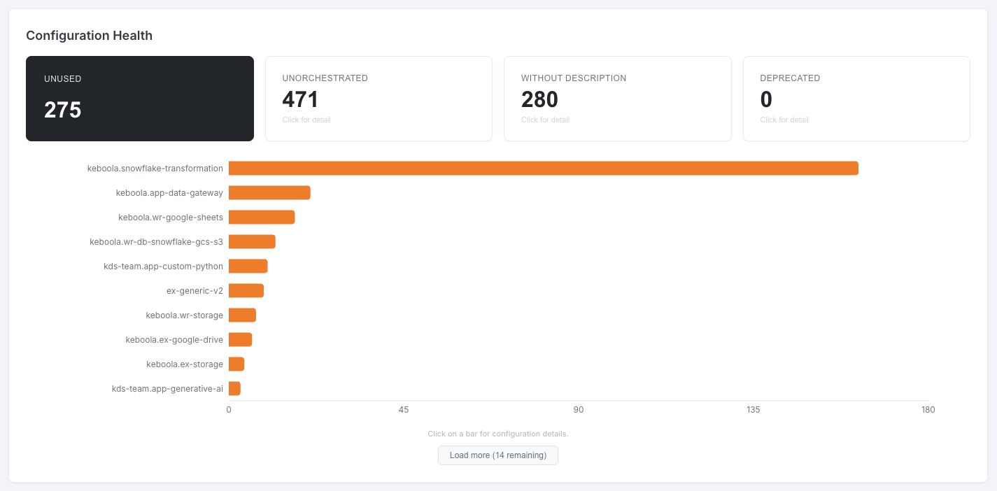
Configuration Health
Section titled “Configuration Health”Four KPI cards act as toggle buttons. Selecting a metric displays a horizontal bar chart broken down by component; clicking a bar drills down to a project and configuration detail table.
| Metric | Description |
|---|---|
| Unused | Configurations with no jobs in the last 90 days |
| Unorchestrated | Configurations not included in any enabled schedule |
| Without Description | Configurations with an empty description |
| Deprecated | Configurations marked as deprecated |
Deleted configurations and configurations in deleted projects are excluded.
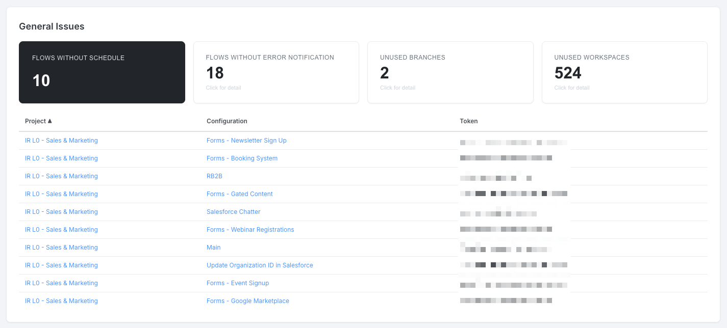
General Issues
Section titled “General Issues”Four KPI cards act as toggle buttons (same pattern as Configuration Health). Selecting a metric shows a detail table.
| Metric | Description |
|---|---|
| Flows without Schedule | Flow configurations not in any enabled schedule |
| Flows without Error Notification | Flow configurations without an error notification subscription |
| Unused Branches | Non-default development branches with no configuration changes in the last 90 days |
| Unused Workspaces | Workspace configurations with no jobs in the last 90 days |
Tables include project and configuration links to Keboola.
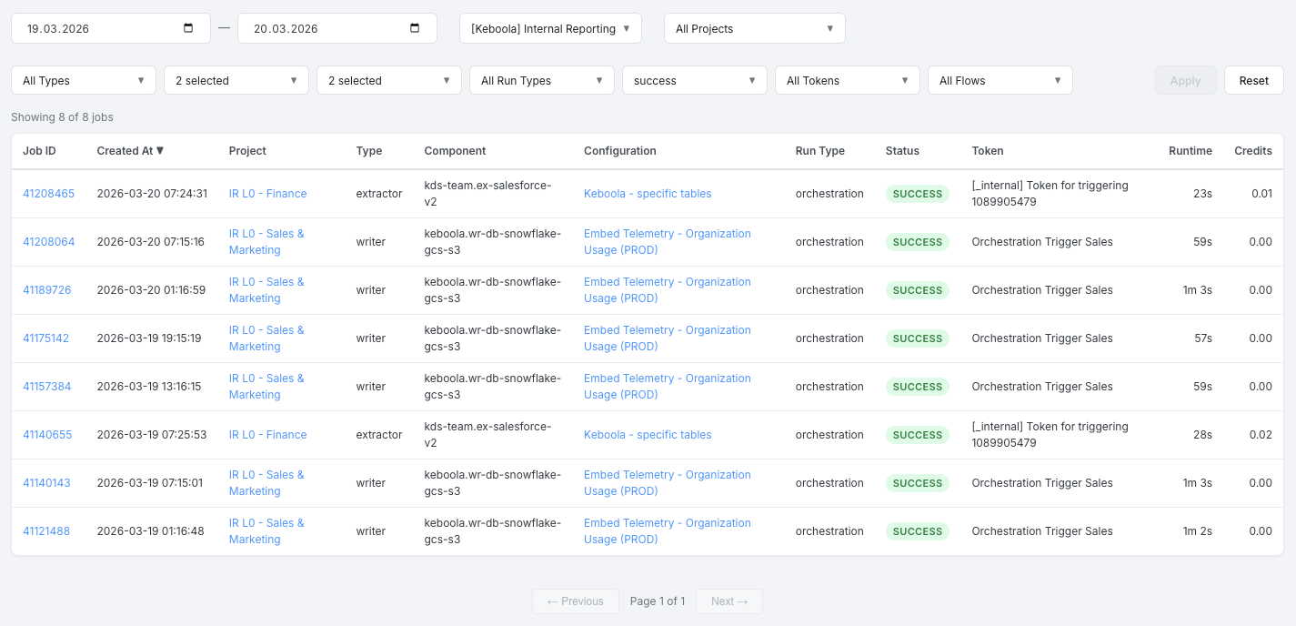
Jobs Monitoring
Section titled “Jobs Monitoring”This tab provides the most granular view of your data — individual job records across all projects, queried directly from the database for the most up-to-date results.
Filters
Section titled “Filters”Seven multi-select filters with fuzzy search are available. Filters are bidirectionally dependent — selecting a value in one filter updates the available options in all others. Click Apply to load data with the current filters, or Reset to clear all filters.
| Filter | Description |
|---|---|
| Types | Component type (e.g., extractor, writer, transformation) |
| Components | Specific component (e.g., keboola.ex-db-snowflake) |
| Configurations | Configuration name |
| Run Types | How the job was triggered (manual, flow, schedule, etc.) |
| Statuses | Job status (success, error, warning, processing, waiting) |
| Tokens | Token that ran the job |
| Flows | Flow the job belongs to |
The date filter defaults to yesterday–today, with a maximum range of 90 days.
Jobs Table
Section titled “Jobs Table”A sortable table (server-side sorting) showing individual job records:
| Column | Description |
|---|---|
| Job ID | Numeric ID, links to the job detail in Keboola |
| Created At | Timestamp in your local timezone |
| Project | Project name, links to the project in Keboola |
| Type | Component type |
| Component | Component ID |
| Configuration | Configuration name, links to the configuration in Keboola |
| Run Type | How the job was triggered |
| Status | Color-coded badge (green = success, red = error, yellow = warning, blue = processing, gray = waiting) |
| Token | Token name |
| Runtime | Job duration in human-readable format |
| Credits | Credits consumed by the job |
Navigation uses Previous / Next buttons with 50 rows per page. The total count is shown as “Page X of Y”.